The Probability Integral Transform (PIT)#
The probability integral transform (PIT) provides a method for assessing to what extent a forecast system is probabilistically calibrated, and may help diagnose particular types of miscalibration. A forecast system is probabilistically calibrated if random draws from its predictive distributions are statistically indistinguishable from the corresponding observations.
The classical definition of the PIT for a particular forecast-observation case is \(\mathrm{PIT}(F,y) = F(y)\), where \(F\) is the predictive cumulative distribution function (CDF) and \(y\) is the value of the observation. If the predictive CDFs are all continuous, and the forecast system is probabililistically calibrated, then the set of all PIT values \(F(y)\) across the set of all forecast-observation cases will be approximately uniformly distributed on the unit interval \([0,1]\).
This definition of PIT needs adjustment to account for cases when the predictive CDFs are discontinuous. Discontinuous CDFs commonly occur with forecasts of precipitation, which is a mixture distribution with two components: the probability of dry conditions and the probability of precipitation given that precipitation occurs. The scores implementation of PIT handles discontinuous predictive CDFs as well as continuous predictive CDFs. It does this by keeping track of left-hand and right-hand
limits of \(F(y)\). We’ll get onto this later in the tutorial.
The scores implementation of PIT also handles inputs in three basic forms:
Inputs are the values \(F(y)\) for each of the forecast-observation cases (or possibly the left-hand and right-hand limits of \(F\) at \(y\) if \(F\) has discontinuities), as calculated by the user. This uses the class
scores.probability.PitFcstAtObs.Inputs are the forecasts and corresponding observations, where the forecasts are in the form of an ensemble. In this case, the predictive CDFs are treated as empirical CDFs derived from the ensemble values. This uses the class
scores.probability.Pitwith a supplied string for theensemble_member_dimargument.Inputs are the forecasts and corresponding observations, where the forecasts are arrays specifying the values (or left- and right-hand limits) of each predictive CDF at a specified set of points \(x\). If an observation \(y\) is not one of specified points \(x\), then the value of \(f\) at \(y\) is determined using linear interpolation. This uses the class
scores.probability.Pitwith a supplied string for thecdf_threshold_dimargument.
Both PIT classes then have identical methods for calculating statistics for PIT histograms, PIT diagrams (cf. PIT uniform probability plots), the variance and expected value of PIT across all forecast cases, and the so-called alpha score. These methods and classes are demonstrated in this tutorial.
For ensemble forecasts, scores.probability.rank_histogram also provides a method for computing rank histograms, which are closely related to PIT histograms. The tutorial on rank histograms gives further information and is illustrated using some of the synthetic case studies of this tutorial.
Case study 1: Predictive CDFs are parametric distributions and continuous#
This case study looks at predictive CDFs that are normal distributions. It will also examine some classic types of probabilistic (mis)-calibration their characteristic PIT histograms and PIT uniform probability plots.
We consider a process \(Y_t\), where \(t=0, 1, \ldots, m\), defined using independent normal distributions by
For each time step \(t\), the observation \(y_t\) is sampled from the process \(Y_t\) at random.
We consider six different forecasters who issue predictive CDFs as follows:
Calibrated (ideal) forecaster: forecasts are \(N(\mu_t, 1)\).
Over-prediction forecaster: forecasts are \(N(\mu_t + 0.3, 1)\). That is, forecast distribution lies to the right of the true distribution.
Under-prediction forecaster: forecasts are \(N(\mu_t - 0.3, 1)\). That is, forecast distribution lies to the left of the true distribution.
Over-dispersed forecaster: forecasts are \(N(\mu_t, (1.3)^2)\). That is, forecast distribution is wider than the true distribution.
Under-dispersed forecaster: forecasts are \(N(\mu_t, (1/1.3)^2)\). That is, forecast distribution is narrower than the true distribution.
Calibrated (marginal) forecaster: forecasts are \(N(0, 2)\). That is, this forecast distribution well-calibrated but has no knowledge of \(\mu_t\). This is equivalent to issuing the climatological forecast for a meteorological process. Forecasts are reliable over the long-run but not accurate.
We’ll generate some observations \(y\), evaluate them at the forecast CDFs \(F\), and then use the PitFcstAtObs class to generate standard statistics and diagrams.
[1]:
import numpy as np
import xarray as xr
from scipy.stats import norm
import matplotlib.pyplot as plt
from scores.probability import Pit, PitFcstAtObs


n_time = 10000  # total time steps

# generate values for mu_t
np.random.seed(seed=42)
mu = norm.rvs(loc = 0, scale = 1, size=n_time)

# generate the observations
obs = xr.DataArray(
    data=norm.rvs(loc = mu, scale = 1, size=n_time),
    dims=['time'],
    coords={'time': range(n_time)},
    name='obs',
)
# calculate the observations evaluated at the forecast CDFs
fcstA_at_obs = xr.DataArray(
    data=norm.cdf(obs, loc = mu, scale = 1),
    dims=['time'],
    coords={'time': range(n_time)},
    name='calibrated (ideal)',
)
fcstB_at_obs = xr.DataArray(
    data=norm.cdf(obs, loc = mu + 0.3, scale = 1),
    dims=['time'],
    coords={'time': range(n_time)},
    name='over-prediction',
)
fcstC_at_obs = xr.DataArray(
    data=norm.cdf(obs, loc = mu - 0.3, scale = 1),
    dims=['time'],
    coords={'time': range(n_time)},
    name='under-prediction',
)
fcstD_at_obs = xr.DataArray(
    data=norm.cdf(obs, loc = mu, scale = 1.3),
    dims=['time'],
    coords={'time': range(n_time)},
    name='over-dispersed',
)
fcstE_at_obs = xr.DataArray(
    data=norm.cdf(obs, loc = mu, scale = 1 / 1.3),
    dims=['time'],
    coords={'time': range(n_time)},
    name='under-dispersed',
)
fcstF_at_obs = xr.DataArray(
    data=norm.cdf(obs, loc = 0, scale = np.sqrt(2)),
    dims=['time'],
    coords={'time': range(n_time)},
    name='calibrated (marginal)',
)

# combine forecasts evaulated at obs into a list
fcst_at_obs_list = [fcstA_at_obs, fcstB_at_obs, fcstC_at_obs, fcstD_at_obs, fcstE_at_obs, fcstF_at_obs]

# generate the Pit class for each forecast system
pit_list = [PitFcstAtObs(fcst_at_obs) for fcst_at_obs in fcst_at_obs_list]
The PIT histogram#
The PIT histogram displays the the relative frequency with which observations fall at different quantile levels of the predictive CDFs. If the forecast system is well calibrated then the histogram should be fairly flat. Let’s look at the output of the .hist_values method, then produce a plot of the PIT histogram for each forecaster.
[2]:
# We'll calculate the histogram values for each forecast system

n_bins = 20  # number of bins in the PIT histogram
histogram_values = [pit.hist_values(n_bins) for pit in pit_list]

# look at the output for the "calibrated (ideal)" forecaster
histogram_values[0]
[2]:
<xarray.DataArray 'calibrated (ideal)' (bin_centre: 20)> Size: 160B
array([0.0476, 0.0484, 0.0472, 0.0489, 0.0528, 0.0537, 0.0477, 0.0495,
       0.0494, 0.048 , 0.0542, 0.0521, 0.0476, 0.0508, 0.047 , 0.0496,
       0.0518, 0.0496, 0.0521, 0.052 ])
Coordinates:
  * bin_centre          (bin_centre) float64 160B 0.025 0.075 ... 0.925 0.975
    bin_left_endpoint   (bin_centre) float64 160B 0.0 0.05 0.1 ... 0.85 0.9 0.95
bin_right_endpoint (bin_centre) float64 160B 0.05 0.1 0.15 ... 0.9 0.95 1.0[3]:
# now plot the PIT histogram for each forecaster

fig, axes = plt.subplots(2, 3, sharex=True, sharey=True, figsize=(6, 4))

for histval, i in zip(histogram_values, range(6)):
    row, col = int(i / 3), i % 3
    axes[row, col].bar(histval['bin_centre'].values, histval.values, width=1/n_bins)
    axes[row, col].axhline(y=1/n_bins, color='k', linestyle='--')
    axes[row, col].set_title(histval.name, fontsize=10)

plt.subplots_adjust(left=0.1, right=0.9, top=0.9, bottom=0.1, wspace=0.2, hspace=0.3)
fig.text(0.5, 0.01, 'PIT value', ha='center')
fig.text(-0.01, 0.5, 'relative frequency', va='center', rotation='vertical')

fig.show()
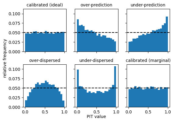
These illustrate basic characteristic shapes of PIT histograms.
Calibrated forecasters (ideal and marginal) have flat histograms.
Forecasters with dispersion issues have U-shaped or inverted U-shaped histograms, with too many observations falling either in the centre of the distribution (if over-dispersed) or in the tails of the distribution (if under-dispersed).
Forecasters with bias (over- or under-prediction) have asymmetric histograms.
PIT diagrams#
PIT diagrams (similar to PIT uniform probability plots) provide another way of visualising miscalibration. A PIT diagram is a plot of graph of the empirical CDF of the PIT values for the set of forecast cases. If the PIT values are uniformly distributed, as would be the case for a probabilistically calibrated system, then the graph will lie close to diagonal line, which is the graph of the CDF of the standard uniform distribution.
Plotting points for the PIT diagram are obtainable from the .plotting_points() method. Let’s get the plotting points for all six forecasters and look at the output for the “calibrated (ideal)” forecaster.
[4]:
plotting_points = [pit.plotting_points() for pit in pit_list]
plotting_points[0]
[4]:
<xarray.DataArray 'calibrated (ideal)' (pit_x_value: 20004)> Size: 160kB
array([0., 0., 0., ..., 1., 1., 1.])
Coordinates:
  * pit_x_value  (pit_x_value) float64 160kB 0.0 0.0 5.754e-05 ... 1.0 1.0 1.0
Values in the array give the y-values for the PIT diagram, while values in the “pit_x_value” dimension give the corresponding x-values.
Here are the PIT diagrams for all 6 forecasters.
[5]:
fig, axes = plt.subplots(2, 3, figsize=(6, 4))

for ppoints, i in zip(plotting_points, range(6)):
    row, col = int(i / 3), i % 3
    axes[row, col].plot(ppoints['pit_x_value'].values, ppoints.values)
    axes[row, col].plot([0, 1], [0, 1], color='k', linestyle='--')
    axes[row, col].set_title(ppoints.name, fontsize=10)

fig.suptitle("Empirical CDF of PIT distributions", fontsize=16)
plt.subplots_adjust(left=0.12, right=0.92, top=0.86, bottom=0.12, wspace=0.4, hspace=0.4)
fig.supylabel('value of ECDF', fontsize='small')
fig.supxlabel('PIT' , fontsize='small')

fig.show()
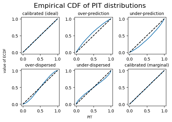
The PIT diagrams give the characteristic shapes for different types of miscalibration.
Output from the .plotting_points() method gives duplicate values in the “pit_x_value” dimension. That is because the empirical distribution will have discontinuities (or veritical jumps in the plot). Duplicate values among coordinates can sometimes cause problems. The plotting_points_parametric() method provides the same information as plotting_points but without duplicate coordinate values.
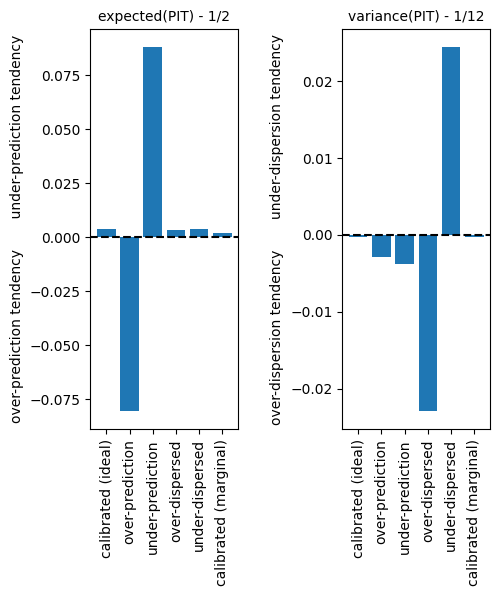
Expected value and Variance of PIT#
The expected value and variance of the empirical PIT distribution can be useful statistics for diagnosing different types of miscalibration. If the forecasting system is calibrated then the distribution of PIT values will be approximately uniform, with an expected value of \(1/2\) and a variance of \(1/12\). Large departures from these values can indicate bias or dispersion problems with the forecast system. The .expected_value() and .variance() methods give the values.
[6]:
# expected value of PIT for the "calibrated (ideal)" forecaster, which is close to 1/2
pit_list[0].expected_value()
[6]:
<xarray.DataArray 'calibrated (ideal)' ()> Size: 8B
array(0.50370607)
[7]:
exp_values = [float(pit.expected_value() - 1/2) for pit in pit_list]
var_values = [float(pit.variance() - 1/12) for pit in pit_list]
fcst_labels = [fcst_at_obs.name for fcst_at_obs in fcst_at_obs_list]

fig, axes = plt.subplots(1, 2, figsize=(5, 5))

axes[0].axhline(y=0, color='k', linestyle='--')
axes[1].axhline(y=0, color='k', linestyle='--')

axes[0].set_ylabel('over-prediction tendency       under-prediction tendency')
axes[1].set_ylabel('over-dispersion tendency       under-dispersion tendency')


axes[0].bar(fcst_labels, exp_values)
axes[1].bar(fcst_labels, var_values)

axes[0].tick_params(axis='x', labelrotation=90)
axes[1].tick_params(axis='x', labelrotation=90)

axes[0].set_title('expected(PIT) - 1/2', fontsize=10)
axes[1].set_title('variance(PIT) - 1/12', fontsize=10)

plt.subplots_adjust(left=0.1, right=0.9, top=0.9, bottom=0.1, wspace=.7, hspace=0.4)

fig.show()
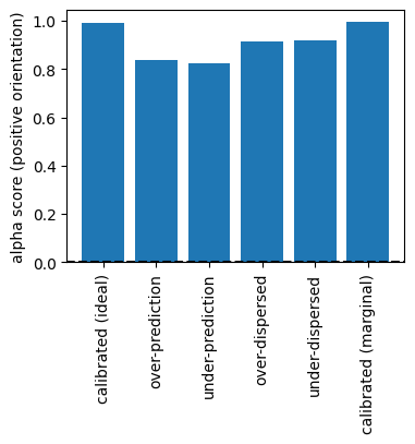
The alpha score#
The alpha score (Renard et al, 2010) is a summary statistic for the disparture of the PIT distribution for a set of forecast cases from the standard uniform distribution. In its negative orientation (the default), the alpha score measures the integrated absolute difference between the PIT CDF and the standard uniform CDF (i.e., the area between the PIT diagram plot and the diagonal). The .alpha_score method calculates the values.
[8]:
# alpha score for forecaster A
pit_list[0].alpha_score()
[8]:
<xarray.DataArray ()> Size: 8B
array(0.00374534)
[9]:
alpha_scores = [float(pit.alpha_score()) for pit in pit_list]

fig, axes = plt.subplots(1, 1, figsize=(4, 3))

axes.axhline(y=0, color='k', linestyle='--')
axes.set_ylabel('alpha score')

axes.bar(fcst_labels, alpha_scores)

axes.tick_params(axis='x', labelrotation=90)

fig.show()
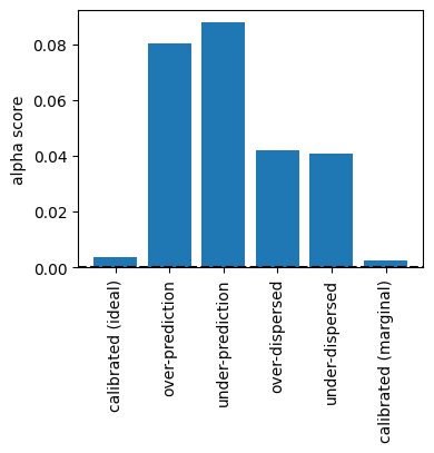
The calibrated forecast systems have the lower alpha scores.
The alpha score can also be calculated in positive orientation, taking values between 0 and 1, with a higher score being better:
[10]:
alpha_scores_positive = [float(pit.alpha_score(negative_orientation=False)) for pit in pit_list]


fig, axes = plt.subplots(1, 1, figsize=(4, 3))
axes.axhline(y=0, color='k', linestyle='--')
axes.set_ylabel('alpha score (positive orientation)')

axes.bar(fcst_labels, alpha_scores_positive)

axes.tick_params(axis='x', labelrotation=90)

fig.show()
Case 2: Predictive distributions are parametric with discontinuities#
We consider a process \(Z_t\), where \(Z_t = \max(0, Y_t)\) for \(t=0, 1, \ldots, m\) and \(Y_t\) is the normal generated process of Case 1. We’ll call this the “clipped process”, since the observations \(z_t\) are generated from the old set of observations \(y_t\) as follows:
[11]:
obs_clipped = obs.clip(min=0)
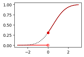
The six forecasters of Case 1 make corresponding forecasts for \(Z_t\) by clipping their predictive CDFs accordingly. We’ll just focus on the “calibrated (ideal)” forecaster, to demonstrate how to handle distributions with discontiuities.
Suppose that \(\mu_t=0.5\) for a particular \(t\). The forecaster’s predictive CDF for \(Y_t\) (black dotted curve) and \(Z_t\) (red solid curve) are shown below:
[12]:
fig, ax = plt.subplots(1, 1, figsize=(3, 2))

xvals = np.linspace(-3, 3, 1000)
yvals = norm.cdf(xvals, loc=0.5)

ax.plot([-3, 0], [0, 0], color='r', linestyle='-')
ax.scatter(0, norm.cdf(0, loc=0.5), color='r', marker='o', s=30)
ax.scatter(0, 0, color='r', marker='o', s=30, facecolor='none')
ax.plot(xvals[xvals >= 0], yvals[xvals >= 0], color='r', linestyle='-')
ax.plot(xvals, yvals, color='k', linestyle=':')

fig.show()
To use PitFcstAtObs when the predictive CDF \(F\) has discontinuities, we need to suppy the fcst_at_obs value \(F(y)\) at the observation \(y\), and also the left-hand limit fcst_at_obs_left value \(\lim_{x\uparrow y}F(x)\) to account for any discontinuity.
First, let’s see what happens if we don’t supply fcst_at_obs_left values (in which case the predictive CDFs are assumed to be continuous):
[13]:
# evaluate the clipped observations at the normal CDF
fcst_at_obs = xr.DataArray(
    data=norm.cdf(obs_clipped, loc = mu, scale = 1),
    dims=['time'],
    coords={'time': range(n_time)},
)

# generate PIT object
pit = PitFcstAtObs(fcst_at_obs)

# get histogram values
bins = 10
hist_vals = pit.hist_values(bins)

# plot the PIT histogram
fig, ax = plt.subplots(1, 1, figsize=(3, 2))

ax.bar(hist_vals['bin_centre'].values, hist_vals.values, width=1/bins)
ax.axhline(y=1/bins, color='k', linestyle='--')

fig.text(0.5, 0.01, 'PIT value', ha='center')
fig.text(-0.01, 0.5, 'relative frequency', va='center', rotation='vertical')
plt.subplots_adjust(left=0.2, right=0.9, top=0.9, bottom=0.2, wspace=.7, hspace=0.4)
fig.show()
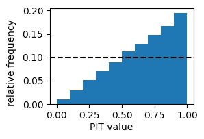
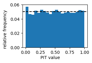
This PIT histogram is characteristic of a forecast system with strong under-prediction tendency: about 19% of observations fall in the top decile of the predictive distributions. This is because we have not accounted for the discontinuity. We rectify this by supplying the left-hand limits of the predictive CFDs at the observations.
[14]:
fcst_at_obs_left = fcst_at_obs.where(obs_clipped > 0, 0)

# generate PIT object
pit = PitFcstAtObs(fcst_at_obs, fcst_at_obs_left=fcst_at_obs_left)

# get histogram values
bins = 10
hist_vals = pit.hist_values(bins)

# plot the PIT histogram
fig, ax = plt.subplots(1, 1, figsize=(3, 2))

ax.bar(hist_vals['bin_centre'].values, hist_vals.values, width=1/bins)
ax.axhline(y=1/bins, color='k', linestyle='--')

fig.text(0.5, 0.01, 'PIT value', ha='center')
fig.text(-0.01, 0.5, 'relative frequency', va='center', rotation='vertical')
plt.subplots_adjust(left=0.2, right=0.9, top=0.9, bottom=0.2, wspace=.7, hspace=0.4)
fig.show()
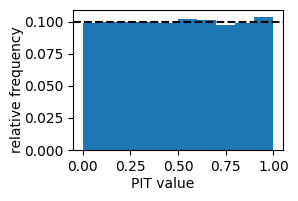
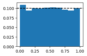
We get a flat histogram, as expected since the observations are have been sampled from a distribution that matches the forecaster’s distribution.
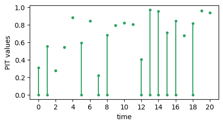
The mathematics underlying PIT in the presence of discontinuous predictive CDFs is described by Taggart (2022), drawing on earlier work by Wand and Robertson (2011) and Gneiting and Ranjan (2013). In a nutshell, if the predictive CDF is \(G\) and the corresponding observation is \(y\) then the PIT of the forecast observation–pair \((G,y)\) is a uniform distribution on the closed interval \([G(y-), G(y)]\), where \(G(y-)\) denotes the left-hand limit of \(G\) and
\(y\). The plot below shows a time series of ‘PIT values’ \([G(y-), G(y)]\) for the “calibrated (ideal)” forecaster. If the forecast \(G\) is continuous at \(y\) then endpoints of the interval \([G(y-), G(y)]\) are identical and the ‘PIT value’ can be represented as single point (e.g. when time = 2). If \(G\) is discontinuous at \(y\) then the endpoints are different and the ‘PIT value’ can be represented as a line segment (e.g. when time = 0). The values of the
endpoints are accessible using the .pit_uniform_endpoints attribute of the Pit and PitFcstAtObs classes.
[15]:
# reserved for timeseries of PIT values
max_time = 20
endpoints = pit.pit_uniform_endpoints.sel(time=slice(0,max_time))
lower = endpoints.sel(uniform_endpoint='lower').values
upper = endpoints.sel(uniform_endpoint='upper').values
xvalues = endpoints['time'].values


# plot the time series histogram
fig, ax = plt.subplots(1, 1, figsize=(5, 2.5))

ax.errorbar(xvalues, lower, yerr=[np.repeat(0, max_time+1), upper - lower], fmt='o', c='#2ca25f',  markersize=3)
ax.plot(xvalues, upper, 'o', c='#2ca25f',  markersize=3)
ax.set_xticks(2 * np.arange(11))
ax.set_xlabel("time")
ax.set_ylabel("PIT values")

fig.show()
Case 3: Predictions are in the form of ensemble forecasts#
Ensemble forecasts are treated as empirical CDFs, which have as many discontinuities as there are ensemble values. These are handled correctly by the Pit class. NaN values among the ensemble members are treated as though there were simply fewer ensemble members.
We’ll give two examples here, both involving the “calibrated (ideal)” forecaster, for the processes \(Y_t\) and \(Z_t\). First we’ll create a 100 member ensemble for \(Y_t\) by randomly sampling the forecasters predictive distribution.
[16]:
n_ensemble = 100  # ensemble size

# broadcast mu_t to have the same shape as the set of ensemble forecasts
mu_broadcast = np.broadcast_to(mu, (n_ensemble, n_time))

# generate the ensemble forecasts
np.random.seed(seed=43)
fcst_ens = xr.DataArray(
    data=norm.rvs(loc=mu_broadcast),
    dims=['ensemble_member', 'time'],
    coords={'ensemble_member': range(n_ensemble), 'time': range(n_time)}
)

# calculate PIT: we need to specify the forecasts, observations and
# ensemble member dimension
pit = Pit(fcst_ens, obs, ensemble_member_dim="ensemble_member")

# plot the histogram
bins = 20
hist_vals = pit.hist_values(bins)

fig, ax = plt.subplots(1, 1, figsize=(3, 2))

ax.bar(hist_vals['bin_centre'].values, hist_vals.values, width=1/bins)
ax.axhline(y=1/bins, color='k', linestyle='--')

fig.text(0.5, 0.01, 'PIT value', ha='center')
fig.text(-0.01, 0.5, 'relative frequency', va='center', rotation='vertical')
plt.subplots_adjust(left=0.2, right=0.9, top=0.9, bottom=0.2, wspace=.7, hspace=0.4)
fig.show()
Note that the values of the first bin in the histogram is a little high. This is because of two reasons.
The histogram bins are \([0, 0.5]\), \((0.5, 0.1]\), \((0.1, 0.15]\), …, \((0.95, 1]\). That is, the right endpoints are always included (the default), but the left endpoint of the first bin is also included.
The ensemble is being treated as an empirical CDF, which means that any observation with a value less then the smallest ensemble value has a PIT value of 0.
The combination of these two facts concentrates more PIT values in the first bin. If we instead call pit.hist_values(bins, right=False), we’ll transfer the problem from the first bin to the last bin. Ultimately, the problem stems from the fact that the empirical CDF is not perfectly calibrated. For this reason, users may prefer scores.probability.rank_histogram, which produces similar plots without interpreting the ensemble as an empirical CDF. Strengths and weaknesses of the two
approaches are further discussed in the rank histogram tutorial.
A major advantage of using Pit is access to all the other PIT methods, such as .plotting_points(), .expected_value() and .alpha_score(). Here is a quick method of generating a PIT diagram for calibrated forecaster and the clipped process \(Z_t\).
[17]:
fcst_ens_clipped = fcst_ens.clip(min=0)
pit = Pit(fcst_ens_clipped, obs_clipped, ensemble_member_dim="ensemble_member")
pit.plotting_points().plot(figsize=(2, 2))
[17]:
[<matplotlib.lines.Line2D at 0x7fd7d5e84e60>]
Case 4: Predictions are CDFs (non-parametric)#
The Pit class can also accept forecasts in the form of an array of predictive CDF values. Intermediate values are determined by linear interpolation. Discontinuities in the predictive CDF can be accounted for by supplying fcst_left values.
Here is an example for the “calibrated (ideal)” forecaster for the process \(Z_t\).
[18]:
# We supply an array of values F(x) where x is from `xvals` as below.
xvals = np.arange(-5, 5, 0.1)
# Note that it is critical that 0 is amongst the x values, as this is where large discontinuities often occur.
# So we'll round the values as a precaution and check that 0 is in the set
xvals = np.round(xvals, 1)
assert 0 in xvals

n_xvals = len(xvals)

mu_broadcast = np.broadcast_to(mu, (n_xvals, n_time))
xvals_broadcast = np.broadcast_to(xvals, (n_time, n_xvals)).T

# array of values of the normal CDF
fcst_cdf = xr.DataArray(
    data=norm.cdf(xvals_broadcast, loc=mu_broadcast),
    dims=['x', 'time'],
    coords={'x': xvals, 'time': range(n_time)}
)
# array of left hand limits of the clipped CDF
fcst_cdf_left = fcst_cdf.where(fcst_cdf['x'] > 0, 0)
# array of right-hand limits of the clipped CDF:
fcst_cdf_right = fcst_cdf.where(fcst_cdf['x'] >= 0, 0)

# calculate PIT. Note that fcst is now in CDF form, and so we supply 'x' as the dimension indexing CDF values
pit = Pit(fcst_cdf_right, obs_clipped, cdf_threshold_dim='x', fcst_left=fcst_cdf_left)
pit.plotting_points().plot(figsize=(2, 2))
/home/rtaggar/scores/src/scores/probability/pit_impl.py:895: UserWarning: Some observations were greater than the maximum `threshold_dim` value in your `fcst`. The value of the fcst CDF at these observations will be set to 1.
  warnings.warn(
[18]:
[<matplotlib.lines.Line2D at 0x7fd7d5efe2a0>]

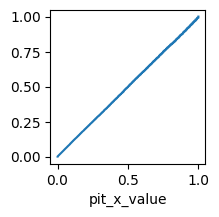
The PIT diagram lies close to the diagonal, as it should for a calibrated forecast.
Case 5: dimension handling and weights.#
Pit and PitFcstAtObs handles dimensions and weights in a similarly to other scores metrics. We conclude with an example to illustrate this.
We adapt an example from Hamill (2001), devised to how that conditionally mis-calibrated forecast systems can have flat PIT histograms. That is, while a calibrated system has an expected flat PIT histogram, a flat PIT histogram does not imply that the forecast system is well-calibrated.
[19]:
# generate observations for three locations, all from the standard normal distribution N(0,1)
np.random.seed(seed=44)
obs = xr.DataArray(
data=norm.rvs(loc=0, scale=1, size=(3, n_time)),
dims=['location', 'time'],
coords={'location': ['city', 'hill', 'valley'], 'time': range(n_time)}
)
# number of ensemble members in each forecast
n_member = 100
# ensemble forecasts for the city are under-predictions N(-0.5, 1)
fcst_city = xr.DataArray(
data=norm.rvs(loc=-0.5, scale=1, size=(n_time, n_member, 1)),
dims=['time', 'ens_member', 'location'],
coords={'time': range(n_time), 'ens_member': range(n_member), 'location': ['city']}
)
# ensemble forecasts for the hill are over-predictions N(0.5, 1))
fcst_hill = xr.DataArray(
data=norm.rvs(loc=0.5, scale=1, size=(n_time, n_member, 1)),
dims=['time', 'ens_member', 'location'],
coords={'time': range(n_time), 'ens_member': range(n_member), 'location': ['hill']}
)
# ensemble forecasts for the valley are over-dispersed N(0, 1.3**2)
fcst_valley = xr.DataArray(
data=norm.rvs(loc=0, scale=1.3, size=(n_time, n_member, 1)),
dims=['time', 'ens_member', 'location'],
coords={'time': range(n_time), 'ens_member': range(n_member), 'location': ['valley']}
)
# combine ensemble forecasts into one data array
fcst = xr.concat([fcst_city, fcst_hill, fcst_valley], 'location')
# include some weights - we'll start with equal weighting on city, hill and valley forecasts
weights = xr.DataArray(data=[1, 1, 1], dims=['location'], coords={'location': ['city', 'hill', 'valley']})
# calculate PIT
pit = Pit(fcst, obs, ensemble_member_dim="ens_member", reduce_dims='all', weights=weights)
# plot the PIT histogram
bins = 10
pit_hist = pit.hist_values(bins)
fig, axes = plt.subplots(1, 1, figsize=(3, 2))
plt.bar(pit_hist['bin_centre'].values, pit_hist.values, width=1/bins)
plt.axhline(y=1/bins, color='k', linestyle='--')
fig.show()
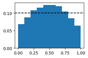
# We get an almost flat histogram
[20]:
# However, we can expose conditional miscalibration by putting a higher weight on some locations and a lower weight on others.

# For example, here is the rank histogram with a high weight on valley forecasts:
weights = xr.DataArray(data=[1, 1, 10], dims=['location'], coords={'location': ['city', 'hill', 'valley']})
# calculate PIT
pit = Pit(fcst, obs, ensemble_member_dim="ens_member", reduce_dims='all', weights=weights)

# plot the PIT histogram
pit_hist = pit.hist_values(bins)

fig, axes = plt.subplots(1, 1, figsize=(3, 2))
plt.bar(pit_hist['bin_centre'].values, pit_hist.values, width=1/bins)
plt.axhline(y=1/bins, color='k', linestyle='--')
fig.show()

# We get an inverted U shaped histogram
Things to try next#
Only the “calibrated (ideal)” forecaster was used to illustrate Cases 2, 3 and 4. Try to expand Cases 2, 3 and 4 by including all the forecasters used in Case 1.
References#
Gneiting, T., & Ranjan, R. (2013). Combining predictive distributions. Electron. J. Statist. 7: 1747-1782. https://doi.org/10.1214/13-EJS823
Renard, B., Kavetski, D., Kuczera, G., Thyer, M., & Franks, S. W. (2010). Understanding predictive uncertainty in hydrologic modeling: The challenge of identifying input and structural errors. Water Resources Research, 46(5). https://doi.org/10.1029/2009WR008328
Taggart, R. J. (2022). Assessing calibration when predictive distributions have discontinuities. Bureau Research Report 64, https://nla.gov.au/nla.obj-3079961862/view
Wang, Q. J., & Robertson, D. E. (2011). Multisite probabilistic forecasting of seasonal flows for streams with zero value occurrences. Water Resources Research, 47(2). https://doi.org/10.1029/2010WR009333